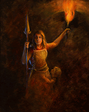
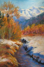
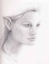
Portrait of Jack. Charcoal and white chalk on toned Strathmore paper. Total working time: 2 1/2 hours. I blocked in the planes of the head with powdered charcoal on a soft flat paint brush then began plotting features of the head. This method seems to work for me because it is a bridge between the intense and long term drafting/observation skills of traditional atelier work (which would drive me quickly insane) and the more gestural big picture work that is too loose for what I wanted here.
I bought a sample of a dozen different charcoal pencils while I was at Dick Blick and Utrecht stores in Portland Oregon for Easter a couple of weekends ago, and I am trying them all out. Up until now, I have been disappointed with my results in using charcoal as a medium. I have been much encouraged to see that most of the problem has been my cheap materials! I used the new toned Strathmore sketching paper for the pretest of materials below. Its great paper...takes some abuse and holds several layers of charcoal without problems. It has some threads and subtle color variety in the paper, but feels smooth to the touch. I really like this paper.
... I have found a big difference between Generals Charcoal and other brands. Generals brand is scratchy and squeeky when it goes on and has a very rough and grainy feel. Not my favorite, at all. Ritmo charcoal glides on like butter... so nice to use! The B size has a super satin feel , the 3B is very dark and also satiny. The HB has a semi-rough feel during application. Pitt/Faber Castel goes on pretty soft, but the medium and soft hardness is really soft. Good for blurry effects, but really beyond my patience level to get a sharp point. If I want something that dark, I will switch to the compressed charcoal sticks and make a more gestural mark. Conte Pierre Noire brand has a stiff and waxy feeling during application and can make a super fine line. The HB pencil is so very hard though, that it feels like you have to grind it into the paper to make a mark. It is very very stiff and makes a medium to light line mark, no matter how hard I pressed. For the impatient artist (moi, you see), it would take a lot of tickling motion and fussy build up to get value changes. It would be good for light value situations or with lots of detail situations, though. Wolff's Carbon Royal Sovereign 6B goes on with a drag feeling and has a waxy feel. I couldn't sense a difference between the 6B and the 4B. Vine charcoal and regular soft charcoal go on super satiny, but they are much lighter in value. I can see why Aristedes atelier and Susan Lyon use them so much. It will give very subtle and dreamy effects and blends easily with no hard edges. A good choice if you are looking for refined results without spending 25 hours doing delicate blending work.
For the next go around, I will try the selection of Char-Kole fat sticks and Cretacolor charcoal lead sticks that Nathan Fowkes uses and some charcoal powders applied super soft like Susan Lyon. Then after that, I'll experiment with conte sanguine and charcoal and white chalk. Turns out how or IF you sharpen your sticks makes another huge difference.
Saturday, April 13, 2013
Subscribe to:
Comments (Atom)


