Wednesday, November 7, 2012
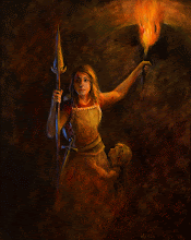
my student's work
Wednesday, October 17, 2012
My student's work

Thursday, October 11, 2012
Great Book
I have added a great new book to my bulging art book cases. This one is not for everyone. Its not a how to book, or a color mixing book, or a color theory book. It is a book that details different tubes of paint colors and how they vary from manufacturer to manufacturer. As an artist of very limited means, I am constantly frustrated by the inconsistencies of pigment colors from one brand to the other. One brand of yellow ochre, for example, can range from chalky yellow brown to vibrant creamy yellow to orange brown to rust! This book shows color swatches by color families of several manufacturers side by side. It will help me in deciding which $30 tube of paint I want to invest in. Now, don't get me wrong. Give me a warm and cool blue, red and yellow and white and I can mix any color I need. (unless its neon or metallics). It's a skill that has taken me years to master, but I am at the stage with my painting where I want some time shortcuts, dang it! And spending hundreds of dollars to play with brands is not an option.
 http://amzn.com/B000977UOI
http://amzn.com/B000977UOI
Online Article
Here is a link to an online LDS newspaper that mentions my art. Click on the link and specify Oct 9, 2012 issue.
www.latterdaysentinel.com
It turned out to be a huge art show. Perhaps over 75 pieces of art in a variety of mediums. It was so great to see both professional and new artists mingle together and be inspired from each other's work. I was especially gratified to talk with artists who were timid about showing their works, or who had never before displayed their art and got to see their pieces displayed in a professional manner. There is such evidence of our divine nature in any work of creation. I am increasingly aware of how much of ourselves we put into our art, and how each piece needs to be treated with care and value.
On another note, I guess in my advancing age, I am finally learning to value things that I don't personally agree with, or care for - as a valid artistic statement in itself. Diversity is a very, very good thing.
Sunday, August 12, 2012
mont st michelle

What a lousy photo capture. Sheesh. I really, really need a SLR camera set up to take better photos of my works. It's crazy hard to take accurate photos that won't blur or be 'way off in color!
Thursday, June 28, 2012
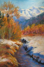
Laguna Beach Heisler Park Finished

Skyler's Art Show


Friday, February 10, 2012
Laguna Beach Heisler Park

Starting a beach scene from reference photos my son and daughter in law sent me. Using the ala prima method, but am going to spread it out over a couple of sessions because I still have to do my day job. This is session one.
Sowa Studio
 I attended a great Ala Prima workshop in portland oregon in late January with Thomas Jefferson Kitts. The location was Kat Sowa's fantastic studio in north portland beneath the St. Johns Bridge. Good old Oregon, very "Twilight" like....Her studio is every artist's dream.
Notan
 A notan is a black and white composition study using in this case, five values. The idea is to clump things into five value masses and compose those masses into interesting abstract shapes with lost edges, hard edges and descriptive brush work. Ala Prima means to do a complete painting in one session, with no sketching, or 'cat licking' of the canvas. You premix your five paint values on your palette and apply the paint with confident strokes. Thomas said " A confident stroke is more important than being right." The method of applying paint communicates to the viewer. Then, since it was not the end of the day and I had more time, I added more details and took it to a finished level. Thomas listened to my detailed plan of attack and said to me "stop overthinking everything!"


Thomas Jefferson Kitts workshop


Notan demonstration. Link the five values into five masses. The abstract shapes of these masses have to be interesting....no cloning, lots and lots of composition issues to deal with as well as lost edges, hard edges, eye flow etc etc. etc. I am seeing 'notan' in everything now. Very interesting.
Notan

We worked in a five value Notan using Raw Umber and white. The idea is to premix your five chosen values and not intermix any of them on the palette or on the canvas. Use expressive brushstrokes and above all, do not 'cat lick' the canvas. Put the stroke down and leave it alone. Thomas said "a confident stroke is more important than being right." Dab dab dabbing reads as tentative to the eye.

Saturday, January 21, 2012
Great Photographer
I have found a wonderful professional photographer here in Spokane who does stunning commercial work and high resolution photos for giclee prints for artists on canvas. I can now offer very large prints of Modern Day Mother in Zion, as well as Receiving Divine Grace. His corporate client base locally and nationally is pretty impressive. I am so grateful to find him.
check out his work at deandavis.com
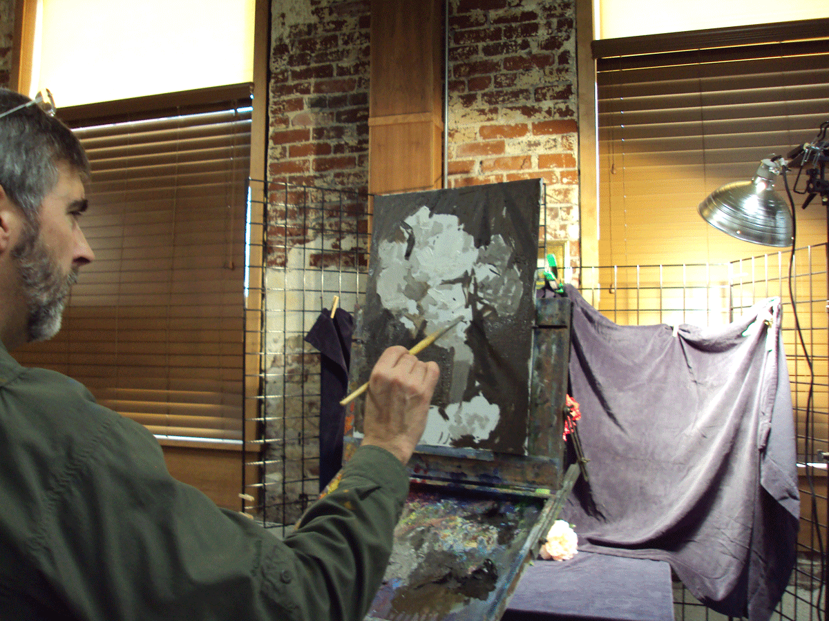
Final Rounds of Judging
 My Receiving Divine Grace painting made it past the first round of judging (shown framed in the background) and I have shipped it off to the art museum for the last round of judging. Wish me luck! Here is my wonderful student, Karley. She was the model for one of the hands in the final painting. Thanks Karley for being a great model!
Oil Painting Commission

 I received an oil painting commission to paint a large landscape of the Wallowa Lake and Chief Joseph Mountains in eastern Oregon. The client requested I combine the view from the photo on the left with a macro view of the mountains (the small color sketch I did on the right). After a google earth search for reference photos of the combined mountain range, it became clear that the composition was going to be a challenge! First of all, combining the two views meant that the entire mountain range needed to be shown. This particular range is fronted by two equal sized range of foot hills. Soooo, the mountains and two foothills create a tootsie-roll effect of three long horizontal bands of equal size and length. Hmmmm... Not visually appealing for a painting at all. The client requested the lake be dominant as well, with lots of blue in the sky and water. Hmmm....ok, this presented some challenges. Since the mountains were in the far distance, and panoramic, and the lake is large and BLUE, I needed to create a visual eye-path so that the viewer can wander about the painting and be entertained in an orchestrated manner. Usually, artists like strong focal points and dramatic lighting to create their visual interest. In this case, it needed to be a portrait of the entire mountain range ( in the far distance, so colors and edges will need to be muted for aerial perspective) yet still give the lake its fair square footage...all the while not overpowering the viewer with blue blue blue. So, I created fog in the foothills to cut down their strong horizontal banding effects and wind and fog patterns on the lake to direct the eye and give some interest to the massive blue expanse. I also invented a small peninsula on the left side and a foreground of snow and shrubs to further direct the eye, and to unite the entire painting with the colors of the rocks and snow shadows on the mountains.
color sketch
 water color and colored pencil sketch to show client the final composition and mood we agreed upon. 6 x 4 on paper.
 Here is the first lay in of color in oils. The clouds and fog were darkened in value so that they would not compete with the snow on the mountains for attention. At this point, it feels more like watercolor painting than oil painting, but I need to save my most expressive brushstrokes and thickest paint applications for the foreground.
close up left side
 This was done ala prima with a burnt sienna layer showing through loose brush strokes. By far the most fun part of creating this painting! Lots of thick rich colors with dry brush edges. It feels more like sculpting than painting to create. I'm definitely going to head off in this direction of paint application for a while and see how much control and emotion I can generate with my brushstrokes....
finished commission

Finished size 36 x 24 without frame. oil on canvas. Still not happy with the way the color is processed on the camera...it shows too blue, but you can still get the idea
Subscribe to:
Posts (Atom)