Friday, April 19, 2019

Exciting Plans!

I know I said I was closing this blog down, but recently I've scrolled through this blog and I gotta say, it is kind of valuable to look at my old work in a self-development way. It is like an old fashioned sketch journal or art diary.   I can see that this blog might, just might have some usefulness to another struggling artist or student out there.

If nothing else, it keeps me humble!   So, I've decided to revisit this blog and keep it updated.


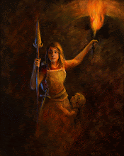
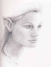
Man, a lot of living has happened in the few years that I started this blog.  From early childhood all I wanted to be when I grew up was an artist.  It is crazy hard. It is sacred to me.  Something of the divine resides in all of us, and when we create, we are following the ultimate creator of the universe in imitating his wondrous abilities.  Even children express themselves in coloring and drawing and experience such self-fulfillment and pride.  I think as we grow and life begins to take it's toll on us, we get discouraged and jaded and lose that childlike wonder of being able to create something.  Anything.  No matter what the world comments about it.

And that is not o.k. 

The world has changed a lot in the last decade. Some of it for the better. Hopefully we are ALL a little (or a lot)  more tolerant of other people, their individuality and the their struggles in life. I think the world needs more art. More striving for excellence in skill and in thought.  It is just a crying shame that creating art and making a decent living to provide for yourself and your loved ones is not a reality for very many people.  That should not stop artists from sharing what they make with the world.  Sometimes it is just time to turn the digital world off.  Create with your own two hands, not for acclaim, not for money, not for any other reason than to give voice to your own emotions, beliefs, experiences.  Create to shout out joy and wonder.  Create to bless someone else. Create to facilitate your own growth as a vibrant human being.

I've done a bunch of art since the last posting here, but I haven't even tried to monetize it.  When galleries take 50% commission right off the top of the retail price, and the artist has to pay for shipping, framing, insurance, marketing promotion, supplies and fees, the actual profit from  the sale of a $600 painting to the artist is around $75.  THAT is crazy.  The internet is a real game changer for artists now.  It is offering artists the chance to connect with people all over the planet who may be interested in buying their art.  It also makes art thieves and copyright breakers have a field day because if they can see it on screen, they'll steal it.  It's a whole new wild west out there!!

 The internet may change what I do eventually, but for now, all I want to do is share what I've done and what I'm doing.

I am venturing out into the digital world doing something that I love, and I'm very excited to share with you and explore what the future holds.

Stay tuned for some updates on what I have planned...I'm working on something really cool!
Here's a hint of future awesomeness: 

https://verycreate.com/


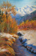
In the meantime, here are some quick pastel color studies currently fresh from my easel.


Tuesday, May 28, 2013

Closing this Blog down and moving

Thanks for following along so far on my artistic journey!  I am closing this blog down and starting a new updated one.  It is time to move on, artistically to a different vein. So, if you would like to see the current, new one, the address is:
ahartcarroll.blogspot.com


Saturday, April 13, 2013

Jack

 Portrait of Jack.  Charcoal and white chalk  on toned Strathmore paper.  Total working time: 2 1/2 hours.  I blocked in the planes of the head with powdered charcoal on a soft flat paint brush then began plotting features of the head.  This method seems to work for me because it is a bridge between the intense and long term drafting/observation skills of traditional atelier work (which would drive me quickly insane) and the more gestural big picture work that is too loose for what I wanted here.
    I bought a sample of a dozen different charcoal pencils while I was at Dick Blick and Utrecht stores in Portland Oregon for Easter a couple of  weekends ago, and I am trying them all out.  Up until now, I have been disappointed with my results in using charcoal as a medium.  I have been much encouraged to see that most of the problem has been my cheap materials!   I used the new toned Strathmore sketching paper for the   pretest of materials below. Its great paper...takes some abuse and holds several layers of charcoal without problems.  It has some threads and subtle color variety in the paper, but feels smooth to the touch.  I really like this paper.  
  ... I have found a big difference between Generals Charcoal and other brands.  Generals brand is scratchy and squeeky when it goes on and has a very rough and grainy feel. Not my favorite, at all.   Ritmo charcoal glides on like butter... so nice to use!  The B size has a super satin feel , the 3B is very dark and also satiny.  The HB has a semi-rough feel during application.    Pitt/Faber Castel goes on pretty soft, but the medium and soft hardness is really soft.  Good for blurry effects, but really beyond my patience level to get a sharp point.  If I want something that dark, I will switch to the compressed charcoal sticks and make a more gestural mark.   Conte Pierre Noire brand has a stiff and waxy feeling during application and can make a super fine line.  The HB pencil is so very hard though, that it feels like you have to grind it into the paper to make a mark. It is very very stiff and makes a medium to light line mark, no matter how hard I pressed.  For the impatient artist (moi, you see), it would take a lot of tickling motion and fussy build up to get value changes.  It would be good for light value situations or with lots of detail situations, though.    Wolff's Carbon Royal Sovereign 6B goes on with a drag feeling and has a waxy feel.  I couldn't sense a difference between the 6B and the 4B.  Vine charcoal and regular soft charcoal go on super satiny, but they are much lighter in value.  I can see why Aristedes atelier and Susan Lyon use them so much.  It will give very subtle and dreamy effects and blends easily with no hard edges. A good choice if you are looking for refined results without spending 25 hours doing delicate blending work.
   For the next go around, I will try the selection of Char-Kole fat sticks and Cretacolor charcoal lead sticks that Nathan Fowkes uses and some charcoal powders applied super soft like Susan Lyon.  Then after that, I'll experiment with conte sanguine and charcoal and white chalk. Turns out how or IF you sharpen your sticks makes another huge difference.

Thursday, March 21, 2013

There are so many great art books in my personal library that I use and refer to for instruction and inspiration!  Here are a couple of my go-to favorites:

Every artist needs this book.  His companion book on creating realism in imaginary scenes and characters is going to be another classic that every illustrator needs to own.
http://www.amazon.com/Color-Light-Guide-Realist-Painter/dp/0740797719/ref=sr_1_1?s=books&ie=UTF8&qid=1363917224&sr=1-1&keywords=color+and+light+by+james+gurney


Great book for painting loose and painterly with some demos and lots of inspirational brushwork.


This lady rocks watercolors.  She does use some 'tricks' and watercolor techniques, but she is such a masterful painter that they just add to the painting, instead of being the subject of the painting.
http://www.amazon.com/How-Make-Watercolor-Paint-Itself/dp/0823099776/ref=sr_1_1?s=books&ie=UTF8&qid=1363917703&sr=1-1&keywords=how+to+make+a+watercolor+paint+itself+experimental+techniques+for+achieving+realistic+effects

This is more of an instructional book on composition mistakes that beginning artists typically struggle with.  It does cover 'seeing' and drawing what you see, but it is not a book like Betty Edwards classic "Drawing on the Right Side of Your Brain". If you wonder why your paintings appear weak or not as vibrant eye catching-wise, then this book can help you go back to the thumbnail stage and correct your basic errors.
http://www.amazon.com/Your-Artists-Brain-right-brain/dp/1440308446/ref=sr_1_21?s=books&ie=UTF8&qid=1363917851&sr=1-21&keywords=composition+in+art+north+light+books

and last but definitely not least, is my latest find.  I had looked at this book in the library years ago and thought "Eh, its ok.".   I am learning soo much lately though, and now that I bought this book on recommendation of another art blog, I am so glad I did.  I guess I didn't have enough background knowledge to process all the great stuff in this book, but I definitely 'get it' now!  This book focuses on strictly watercolor landscapes as the topic, but if you look beyond the landscape subjects, the topics translate into virtually any visual genre. If you want to infuse emotional content into your work, get this book.
http://www.amazon.com/Emotional-Content-Create-Paintings-Communicate/dp/192983425X/ref=sr_1_1?ie=UTF8&qid=1363918438&sr=8-1&keywords=emotional+content+brommer

Wednesday, November 7, 2012

my student's work

This wonderful painting was done by my twelve year old art student.  This is her very first oil painting EVER. Great job, Eliza.N.!!  It was worth the struggle!

Wednesday, October 17, 2012

My student's work

I am enjoying giving private painting and drawing lessons this fall and I am sooo proud of one of my art students Rachel N. and her very first oil painting!  I love the glow of the grapes and how she utilized the concept of lost edges and focal point!  Can't wait to see her next painting.

Thursday, October 11, 2012

Great Book

I have added a great new book to my bulging art book cases.  This one is not for everyone.  Its not a how to book, or a color mixing book, or a color theory book.  It is a book that details different tubes of paint colors and how they vary from manufacturer to manufacturer.  As an artist of very limited means, I am constantly frustrated by the inconsistencies of pigment colors from one brand to the other.  One brand of yellow ochre, for example, can range from chalky yellow brown to vibrant creamy yellow to orange brown to rust!  This book shows color swatches by color families of several manufacturers side by side.  It will help me in deciding which $30 tube of paint I want to invest in.   Now, don't get me wrong.  Give me a warm and cool blue, red and yellow and white and I can mix any color I need. (unless its neon or metallics). It's a skill that has taken me years to master, but I am at the stage with my painting where I want some time shortcuts, dang it!  And spending hundreds of dollars to play with brands is not an option.
Artist's Color Manual: The Complete Guide to Working With Colorhttp://amzn.com/B000977UOI